4.9 GOOGLE RATING

 Australian
  UK
UK Different Types of Logos

What Makes a Good Logo
In many cases, a logo will be the first impression a customer gets of a brand. A professional logo can increase customer confidence by 75%, so considering how much is at stake, you’ll want to make sure your logo works as a brand ambassador that’s easily recognisable by customers.
In this article, we look at the different types of logos and at the factors you need to keep in mind to create a logo that stands out and represents your brand’s identity in physical and digital settings.
Types of Logos and Who They’re for

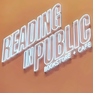
1. Wordmarks
Wordmarks display only the company’s name, and are very effective getting a brand’s name and image out there. This type of logo helps achieve better recognition, recall, and authority.
Examples: Google, Canon, Disney.
Suitable for: Newly formed companies that want to build brand recognition, businesses in the e-commerce or retail sectors, and brands with catchy names.

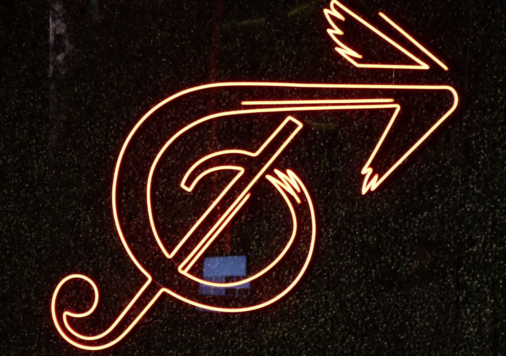
2. Lettermarks
Lettermarks or monogram logos are typically used by brands with long names, as they feature the company’s initials for a simplified and easy-to-remember visual.
Examples: HBO, CNN, P&G.
Suitable for: Companies with long or complicated names, tech companies, or law firms.
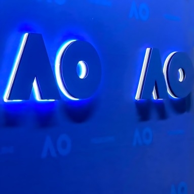
Case study: The Australian Open lettermark logo was built into a custom LED neon sign with excellent results.
3. Brandmarks
Brandmarks or pictorial logos consist of an image, graphic, or symbol that represents a brand and its values. These logos don’t contain any text.
Examples: Shell, Twitter, Apple.
Suitable for: Companies with a global presence, as they eliminate language barriers. They’re also suitable for businesses in the travel sector (since international customers use them), and for non-profit organizations.
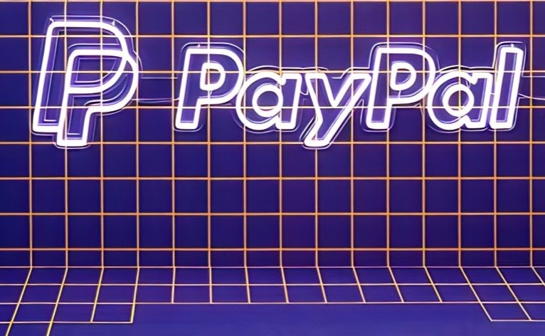
4. Combination logos
These logos feature both text and a graphic element. Once a company is well-known, they can use either aspect separately or the combined logo. Approximately 60% of top 500 companies use this type of logo, and research shows it can be 6% more memorable than other options.
Examples: Lacoste, Pepsi, PayPal.
Suitable for: Companies already established in the market, or with an ample budget for marketing campaigns that build awareness and recognition.
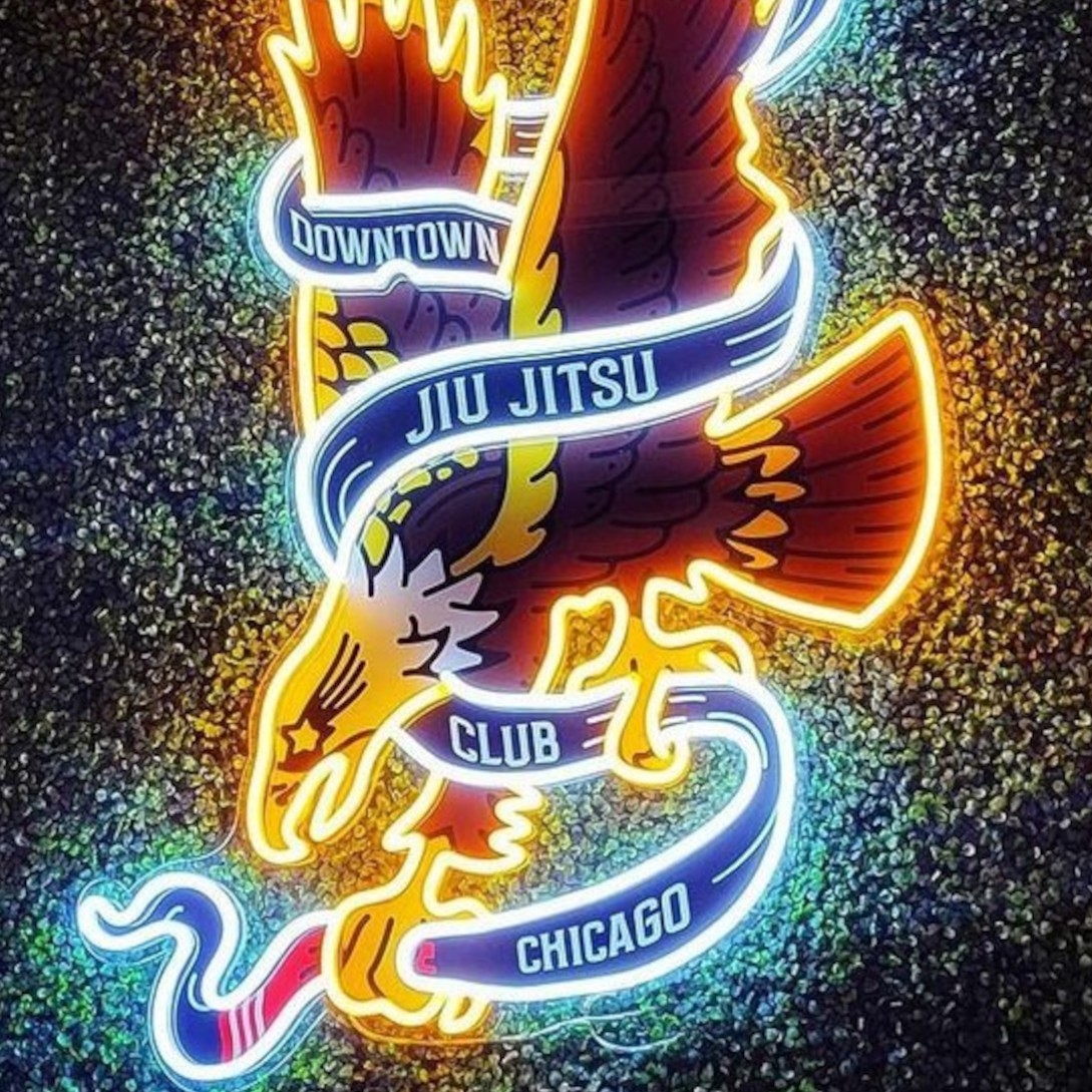
5. Emblems
Emblems are similar to combined logos in that they also feature text and graphics. The difference is that in emblems, text is often embedded within the image or symbol, being similar to a badge.
Examples: BMW, Harley-Davidson, Starbucks.
Suitable for: Educational institutions, sports teams, gyms and health clubs, artisan brands.

6. Mascot logos
Mascot logos use a fictional character to represent a brand visually and to create an emotional connection with the audience.
Examples: KFC, Pringles, Mr Muscle.
Suitable for: Common in food and beverage branding, companies selling products for children, and businesses in the leisure sector.
What Makes a Good Logo
Tips for Good Brandmarks
Simplicity: A good brand icon or brandmark should be simple and non-ambiguous.
Scalability: The logo should be scalable, meaning that the graphic should retain its clarity and integrity at any size.
Memorability: The logo should be memorable for its originality and distinctiveness – avoid brandmarks that are similar to other companies’ logos.
Tips for Good Combination Logos
Balance: A good combination logo balances text and imagery to ensure neither element overpowers the other. The harmony between the two components should be visually appealing.
White Space: The logo should make smart use of white space to avoid a cluttered look and to ensure that both text and graphics stand out.
Tips for Good Emblems
Classic Appeal: Emblems should have a timeless quality, since they’re typically used by brands that want to highlight concepts like tradition or craftmanship.
Symbolism: Emblems often incorporate symbols that have specific meanings linked to the brand’s values, products, or history. However, the symbols should not be so obscure or abstract that the meaning doesn’t get across to the audience.
Tips for Good Lettermarks
Distinctiveness: Using a custom font or style is a good option to ensure the logo makes a lasting impression.
Letter Spacing: This aspect can be modified to create different effects. For example, a letttermark with tightly spaced letters transmits stability and interconnection. On the other hand, widely spaced letters suggest strength and sophistication. Letters can also overlap if you want to add a playful touch.
Legibility: Although these logos only contain a few letters, a poor font choice can make them hard to read, especially in digital mediums like small mobile phone screens.
Tips for Good Wordmarks
https://ralev.com/whats-the-lifespan-of-a-logo/Versatility: The average lifespan for a professional logo is 10 years. Since most logos will need to be updated as new trends emerge, the design should be versatile enough to ensure the logo will transmit the same sense of uniqueness and confidence even after future updates.
Striking Color: Because there aren’t any other elements competing for attention, a wordmark logo can benefit from bold and distinctive font colors, as long as these choices match your company’s color scheme.
Tips for Good Mascot Logos
Relatability: The mascot should evoke positive and universal emotions, which will help create a strong connection with the audience. In a way, mascot logos should embody positive characteristics that your target customers admire.
Proportion: A good mascot logo should be adaptable for use in different marketing materials, from digital platforms to physical products, ensuring consistent brand representation and visibility in all mediums and sizes.
How to Create a Good Logo
1. Research
Know Your Audience: A good brand icon or brandmark should be simple and non-ambiguous.
Competitor Analysis: The logo should be scalable, meaning that the graphic should retain its clarity and integrity at any size.
2. Concept Development
Brainstorming: Gather as many sketches as you can, and experiment with size, letter and graphic placement, colour, contrast, white space, etc.
Feedback: Choose a few of the sketches that best express your brand’s identity and request feedback from clients, staff, and designers.
3. Refine and Test
Multiple Mockups: To assess the logo’s effectiveness in real-world scenarios, create mockups of the logo and see how it would look on business cards, websites, and merchandise. In most cases, it’s common to have at least three versions of a logo: primary, submark (for small spaces), and favicon (for Internet browsing).
Conclusion
A good logo is a strategic marketing tool that conveys a brand’s identity, values, and message. In this post, we’ve looked at the different types of logos and what makes each one effective. Irrespective of which logo you choose, focusing on simplicity, memorability, scalability, and relevance will help you create a logo that resonates with your audience and leaves a lasting impression.
To find out more about our research or request an interview:
Get in touch with our Media & Outreach team now by contacting

Clare Jones
Global Outreach Manager
Email: clare@customneon.com
LinkedIn: Clare Jones
All product names, logos, and brands are the property of their respective owners. All company, product, and service names used in this website are for identification purposes only.
More research commissioned or undertaken by Custom Neon® can be found by clicking the following links: