FREE SHIPPING - ALL SIGNS!
 4.9 GOOGLE RATING
 2 YEAR WARRANTY
4.9 GOOGLE RATING
FREE SHIPPING - ALL SIGNS!
2 YEAR WARRANTY

 Australian
  UK
UK How to Style a Custom Neon Sign at Home
A Comprehensive Guide from Interior Designers and Sign Specialists
Neon has moved well beyond bars and shopfronts and is one of the easiest ways to give a room personality, warmth, and a focal point that feels entirely your own. Custom and personalized designs now make up roughly 40 to 50 percent of the global neon signs market, according to Verified Market Research, much of it homeowners using a sign as a piece of self-expression.
Drawing on years of experience and designer collaborations, this guide pulls together how interior designers and sign specialists actually style neon throughout the home, from the wall above a bed to the open-plan kitchen that needs a bit of warmth.
Start with the Sign, then Style the Space
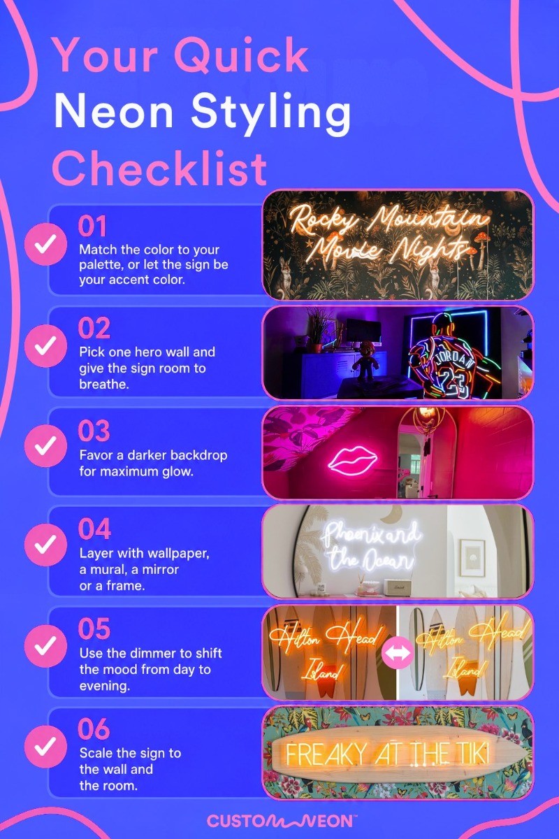
How a sign reads in a room comes down to three things: color, wording, and scale. Settle these before you start styling, and the rest, from the backdrop to the finishing touches, falls into place far more easily.
Color
Warm white and soft pastels blend into calm, considered interiors. Bright pinks, blues, and oranges bring energy and pop against bold décor. With a wide range of colors, you can match an existing palette or use the sign as the accent the whole room builds around.
Font and Wording
The words make the connection; the font sets the mood. A family surname, a favorite lyric, an inside joke, a line that means something to you: the pairing of message and typography does a lot of the work in how a sign reads in a room.
Size and Placement
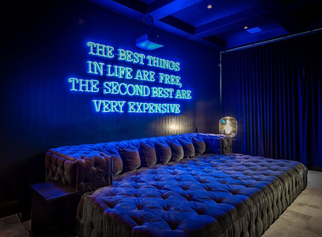
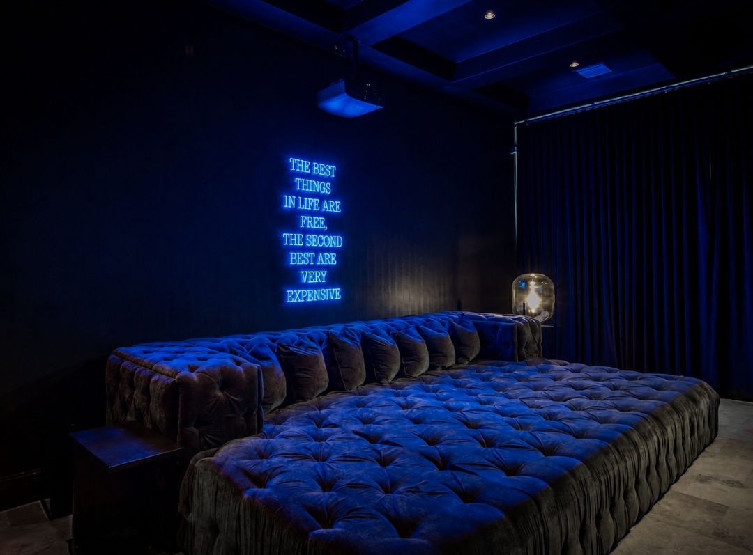
A well-styled sign feels appropriately scaled to both the wall and the room. Consider how the sign relates to nearby furniture, the viewing distance, and the role it will play in the space, whether that's serving as a focal point or contributing to the overall atmosphere. A dimmer lets you shift the feel as the day goes on.
Designer Tip:
Every room needs one moment that pulls the eye. Decide what that is first, then style the rest of the space to support it rather than compete with it.
Five Styling Principles for Incorporating Neon into Interiors
1. Use contrast to create impact
The relationship between a sign and its backdrop has a significant influence on its visual impact. Lighter signs often stand out most against darker walls, while bold colors can create energy against neutral surfaces. Contrast helps establish the sign as a focal point within the room.
2. Layer it with texture
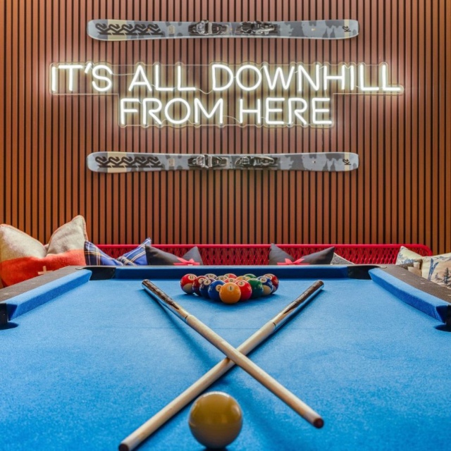
Neon contrasts particularly well with textured surfaces such as exposed brick, wallpaper, timber paneling, murals, and feature walls. The interplay between light and texture adds depth, helping the sign feel integrated into the space instead of simply mounted on it.

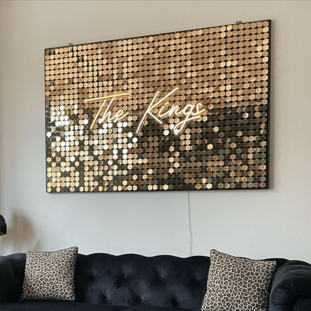
3. Frame it or float it
The installation method can influence the overall aesthetic. Mounting a sign within a frame or on a backing panel gives it the presence of a piece of artwork, while mounting it directly onto the wall creates a cleaner, more contemporary look.
4. Pair it with reflective surfaces
Positioning a sign near a mirror or other reflective surface can amplify its visual impact by extending the glow and creating additional depth within the room.
5. Consider how lighting changes throughout the day
The role of a neon sign often shifts between daytime and evening use. Adjustable brightness allows the sign to function as a statement feature when desired and a softer ambient light source when a more relaxed atmosphere is preferred.
Designer Tip:
Mirrors are a stylist's shortcut. They bounce light around, make a small room feel bigger, and double anything beautiful placed in front of them. Position one thoughtfully and a corner does twice the work.
Styling Neon Room by Room
Bedrooms
The bedroom is often the most personal room in the home, making it a natural place for signage that reflects identity, memories, or meaningful sentiments. Names, favorite words, subtle affirmations, and meaningful phrases can all work well, particularly when styled as part of the room rather than as a standalone feature.
A striking example comes from interior designer Dena Feintuch, who took a mother's motto, "make sparks", and placed it above her daughter's bed. A positive line to wake up to.
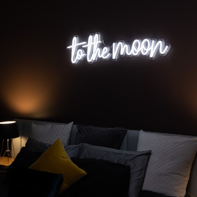
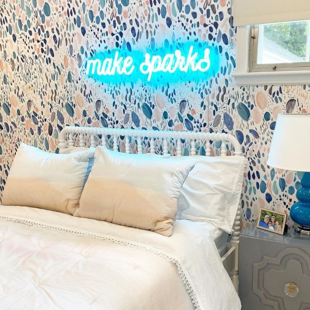
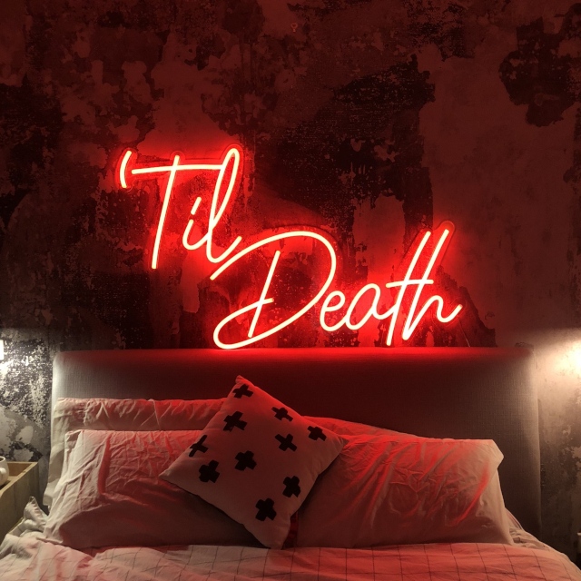
Many designers position signs above the bed, where they can act as a focal point and help anchor the space. Softer colors such as warm white, pale blue, or pastel tones tend to suit bedrooms, creating atmosphere without overwhelming the room. Patterned wallpaper, upholstered headboards, and textured wall finishes can also provide an effective backdrop, adding depth and helping the light feel integrated into the overall design.
Because bedrooms do different jobs across the day, from getting ready in the morning to winding down at night, adjustable brightness keeps the space comfortable and versatile.
Designer Tip:
Personalized wording creates emotional connection, while softer colors and considered placement help maintain a calm, restful atmosphere.
Living Rooms
The living room is your space to make a statement. A bold word sign or family name behind the sofa instantly becomes the focal point. One clean example comes from HGTV designer Brian Patrick Flynn, who styled a blue word sign on a white wall behind a U-shaped couch, then tied it together with a blue rug and cushions. The lesson is simple: pick one hero spot, let the sign own it, and echo its color in the surrounding décor.
Designer Tip:
A sign's impact isn't fixed. Brightness control lets the same feature create completely different moods.
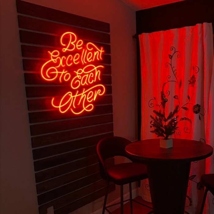
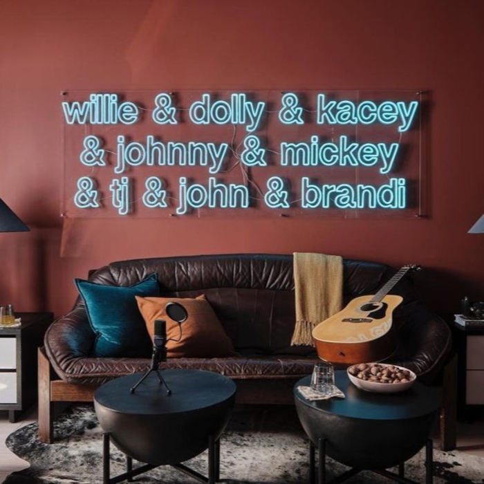
Kitchen and Dining Rooms
The kitchen is the heart of the home, which makes it a natural fit for warmth and a bit of humor. Quote signs, food puns and "gather"-style sentiments all sit well here. Designer Deborah Plant of Zebra Interiors styled a simple warm white sign against the dark wall of an open-plan kitchen-dining room, where the soft glow stood out beautifully. Home stylist Tiffany Han topped an earthy orange, yellow and pink wall with a "my happy place" sign in a bold script. Warm white tends to flatter food and faces, so it's a safe, lovely choice for rooms where people eat together.
Home offices and kids' rooms
A motivational quote keeps a home office feeling intentional and on-brand for the work you do there. In a kids' room, a name sign or a fun phrase doubles as a gentle night light with the dimmer turned right down. Both rooms reward a sign that reflects the person who uses the space.
Designer Tip:
In a child's room, mount the sign out of reach and keep the dimmer low at night so it works as a soft night light rather than a glare.
A motivational quote keeps a home office feeling intentional and on-brand for the work you do there. In a kids' room, a name sign or a fun phrase doubles as a gentle night light with the dimmer turned right down. Both rooms reward a sign that reflects the person who uses the space.
Designer Spotlight: Somerled Designs
Somerled Designs specializes in turning short-term rentals into standout, high-performing properties, and LED neon is a regular part of how they style those homes. What makes their work worth studying is the styling itself: pairing signs with murals and wallpaper, framing them for feature walls, adding them to mirrors as selfie signs, and using them to lift artwork and set a room's mood.
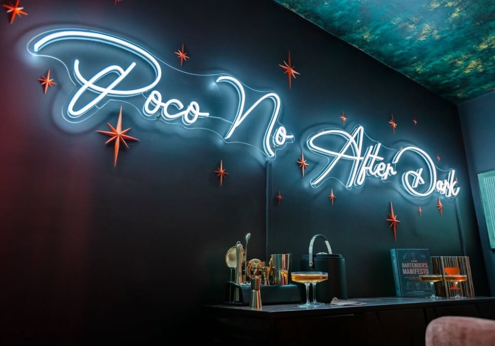
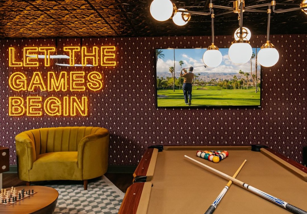
We absolutely love incorporating Custom Neon signs into our Airbnb interior design projects. They’re the perfect way to infuse personality and fun into every space we create. The variety of colors, fonts, and styles means we can always design something that fits our vision perfectly in any market. The quality is exceptional, and I feel confident recommending them to clients because I know they’re built to last. They’re also so easy to install and enjoy. Every sign makes such a bold statement that we can’t help but be obsessed!
Jordan McDonough Somerled Co-Founder
Designer Tip:
Choose a wall with pattern or texture, then place the sign so it interacts with the surface behind it rather than sitting in isolation.
Designer Spotlight: The Rath Project
Sometimes the secret to styling a space is creating one unexpected focal point. In this Manhattan brownstone, The Rath Project used a hot pink Custom Neon sign to transform a simple white-painted brick wall into a statement feature. The vibrant glow instantly draws the eye, while the exposed brick provides the perfect neutral backdrop, allowing the color to shine without overwhelming the room.
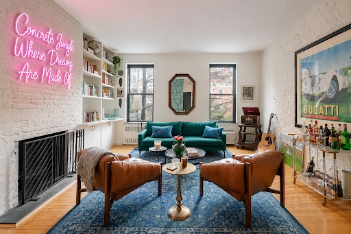
…I couldn’t help showing you that sometimes a client’s dream of a neon sign is too good not to fulfill! Couldn’t imagine anything else hanging in this NYC brownstone- thanks @customneon for giving customers the opportunity to have such unique custom pieces (not sponsored, just really happy with the results)
What makes this vignette work so well is the thoughtful color pairing. The pink neon is echoed throughout the space by the rainbow-arranged bookshelves, creating a sense of cohesion and playfulness. The result is a look that feels curated rather than chaotic. The lyric "Concrete Jungle Where Dreams Are Made Of" adds another layer of personality, bringing unmistakable New York energy into the home. Referencing the iconic Empire State of Mind anthem, the sign celebrates the city's culture while giving the room a sense of place and story.
Designer Tip:
Pair bold light with textured, neutral surfaces and repeat the sign's color elsewhere in the room. That balance helps the sign read as part of the room's design.
Every home is different, which is why so many neon signs are made to order around a specific phrase, color, and font. Start with the room's focal point, choose a backdrop that lets the glow do its work, and let the wording carry the personality. The rest is placement.
To find out more about our research or request an interview:
Get in touch with our Media & Outreach team now by contacting
Clare Jones
Global Outreach Manager
Email: [email protected]
LinkedIn: Clare Jones
All product names, logos, and brands are the property of their respective owners. All company, product, and service names used in this website are for identification purposes only.
More research commissioned or undertaken by Custom Neon® can be found by clicking the following links: